
Client
Torrens University
Project
Telstra Enterprise Mobile App
This project enhances Telstra Enterprise v2.0 by adding real-time updates, customisable dashboards, and streamlined support access. These improvements aim to provide instant notifications, up-to-date information on network performance, and quick access to help, enabling businesses to make informed decisions swiftly, reduce inefficiencies, and increase user satisfaction.
Role
• UX Designer • Researcher • UI Designer • Product Management
Tools
• Figma • Illustrator • Photoshop • Zoom • Maze • Asana
Problem Statement & Goals
The client wanted a clearer, more intuitive digital experience for enterprise customers managing complex telecom services. The focus was on simplifying dashboards, improving navigation, and making it easier for businesses to access billing, service data, and support without relying heavily on manual assistance.
The main goals were to reduce customer friction, lower support costs, and increase platform adoption among enterprise clients. By improving usability and transparency, the business aimed to strengthen client trust, improve retention, and position Telstra Enterprise as a reliable, scalable digital partner for large organisations.


Problem & solutions
Enterprise users struggled with cluttered interfaces, unclear data hierarchy, and too many touchpoints to complete simple tasks.
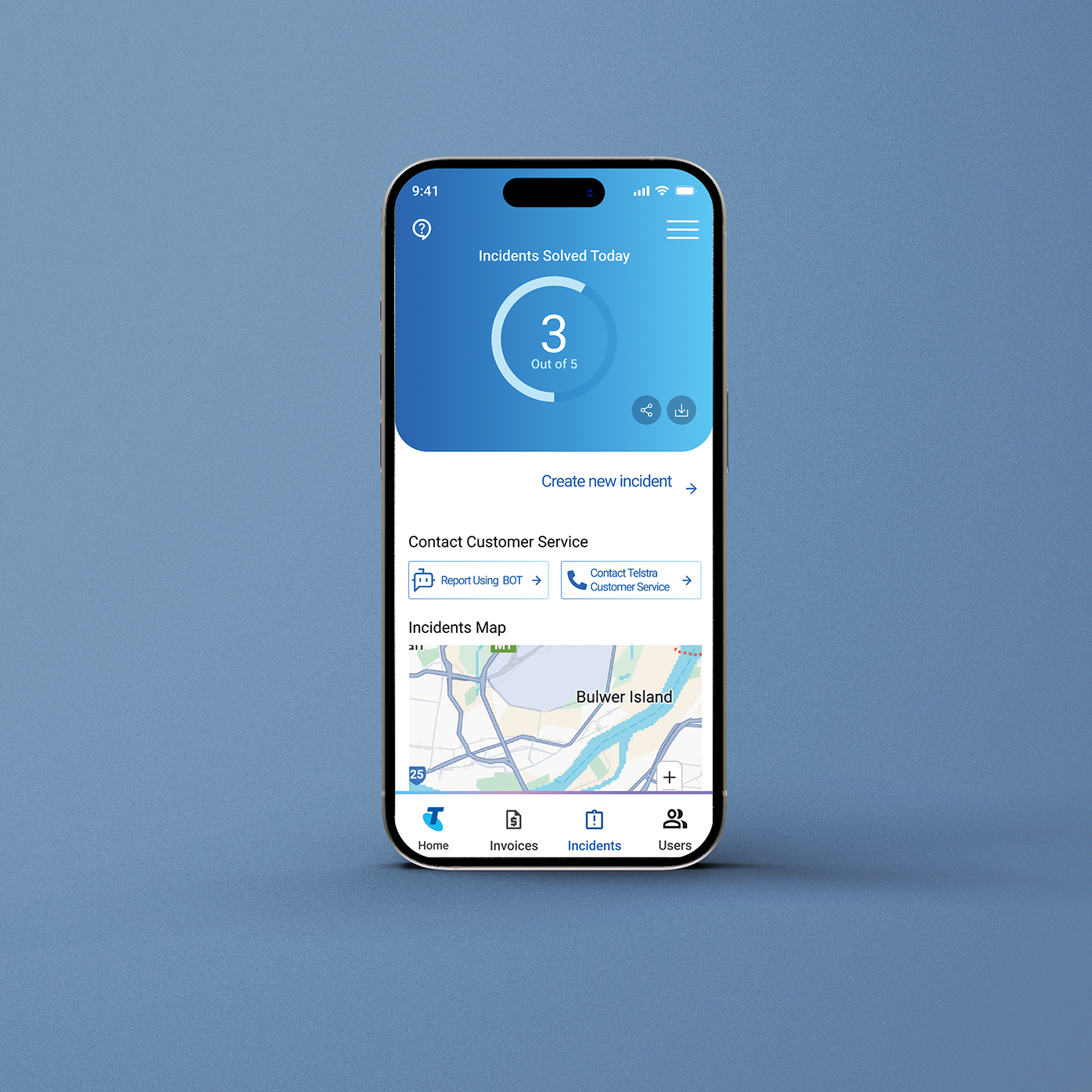
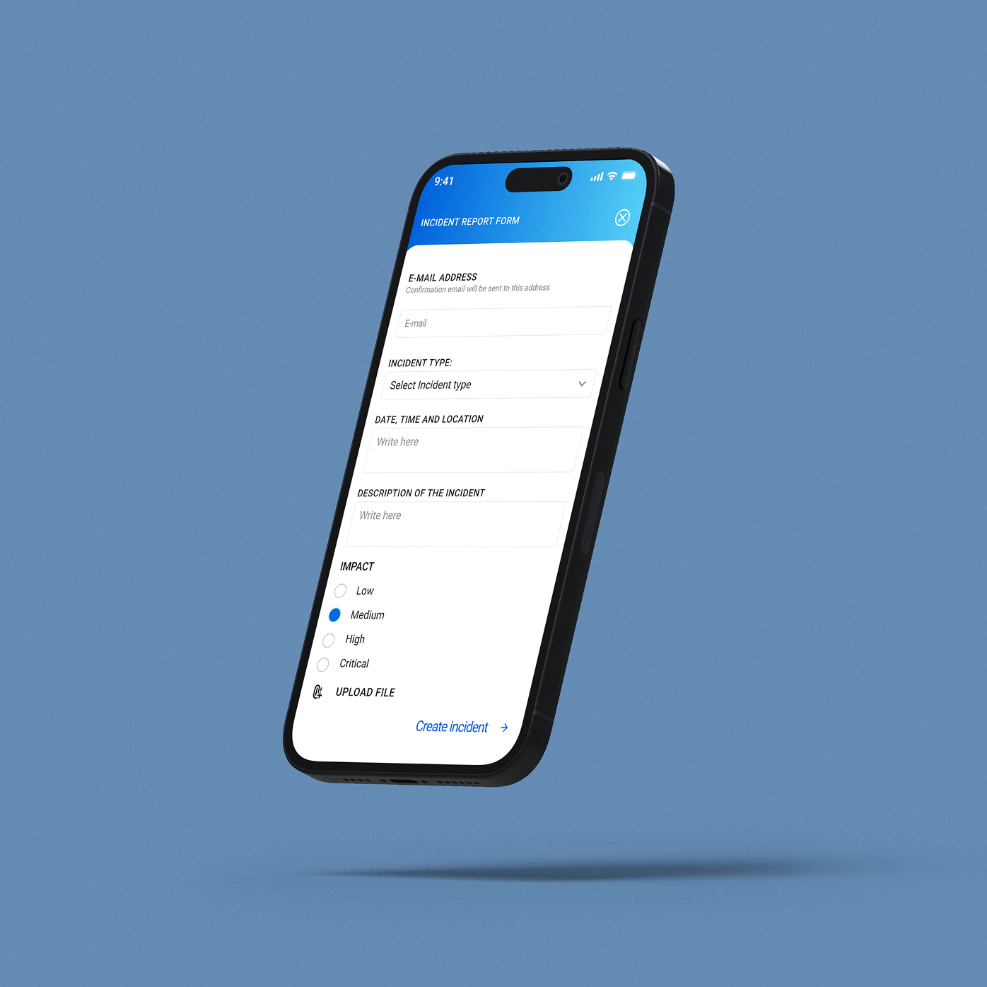
Redesigned the dashboard with clear information hierarchy, modular components, and prioritised key actions (billing, services, support) to reduce cognitive load and improve task efficiency.
Businesses lacked a transparent overview of active services, usage, and billing breakdowns, leading to confusion and increased support calls.
Introduced a centralised service overview with real-time status indicators, clearer billing summaries, and simplified reporting tools for better control and decision-making.
Enterprise clients often needed to contact support for account changes or troubleshooting due to unclear system flows.
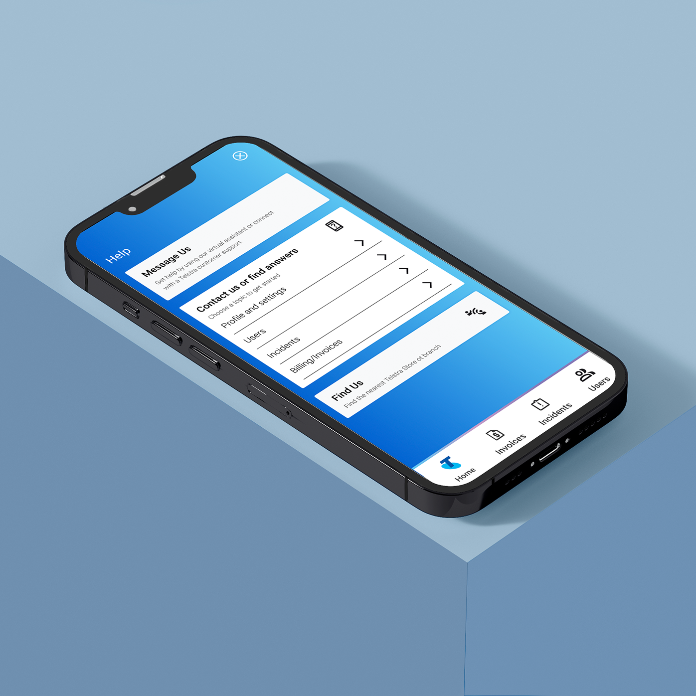
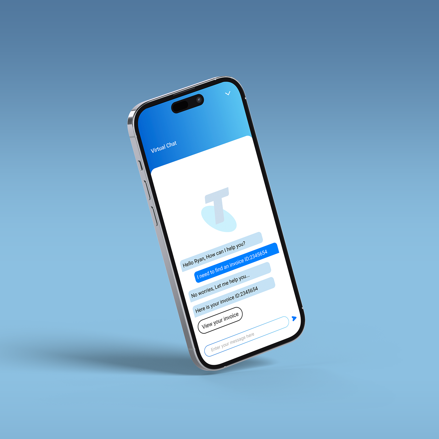
Improved self-service functionality with guided workflows, clearer navigation paths, and contextual help features to reduce reliance on support teams and increase platform adoption.
Project Stages
1. Research & Discovery
Defined the enterprise context, analysed user needs, mapped pain points, and identified gaps in the existing digital experience.
2. Problem Framing
Clarified key usability challenges and translated them into focused design objectives aligned with business goals.
3. UX Strategy & Structure
Created personas, user journeys, and information architecture to simplify complex service management flows.
4. Wireframing
Designed low-fidelity layouts to test dashboard structure, hierarchy, and navigation logic.
5. UI Design & Prototyping
Developed high-fidelity screens in Figma with a scalable component system tailored for enterprise use.
6. Refinement
Iterated based on usability principles to improve clarity, consistency, and overall system usability.

UX Design - Research & Ideation Phase Summary
In this stage, I focused on defining the right problem before designing any solutions. I began by understanding the client’s goals, brand context, and target personas, then analysed competitors to identify gaps and pain points. I mapped where the new feature would sit within the existing product ecosystem by developing its information architecture and task analysis.
Finally, I generated multiple concepts, structured them through hypotheses and service blueprints, and selected the strongest idea for further development. The goal was to build a clear, strategic foundation before moving into prototyping.
UI Design
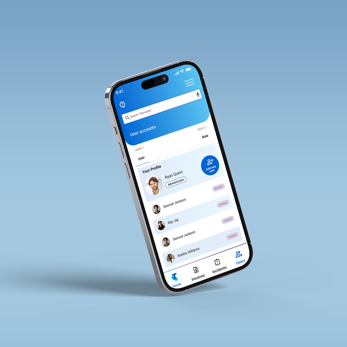
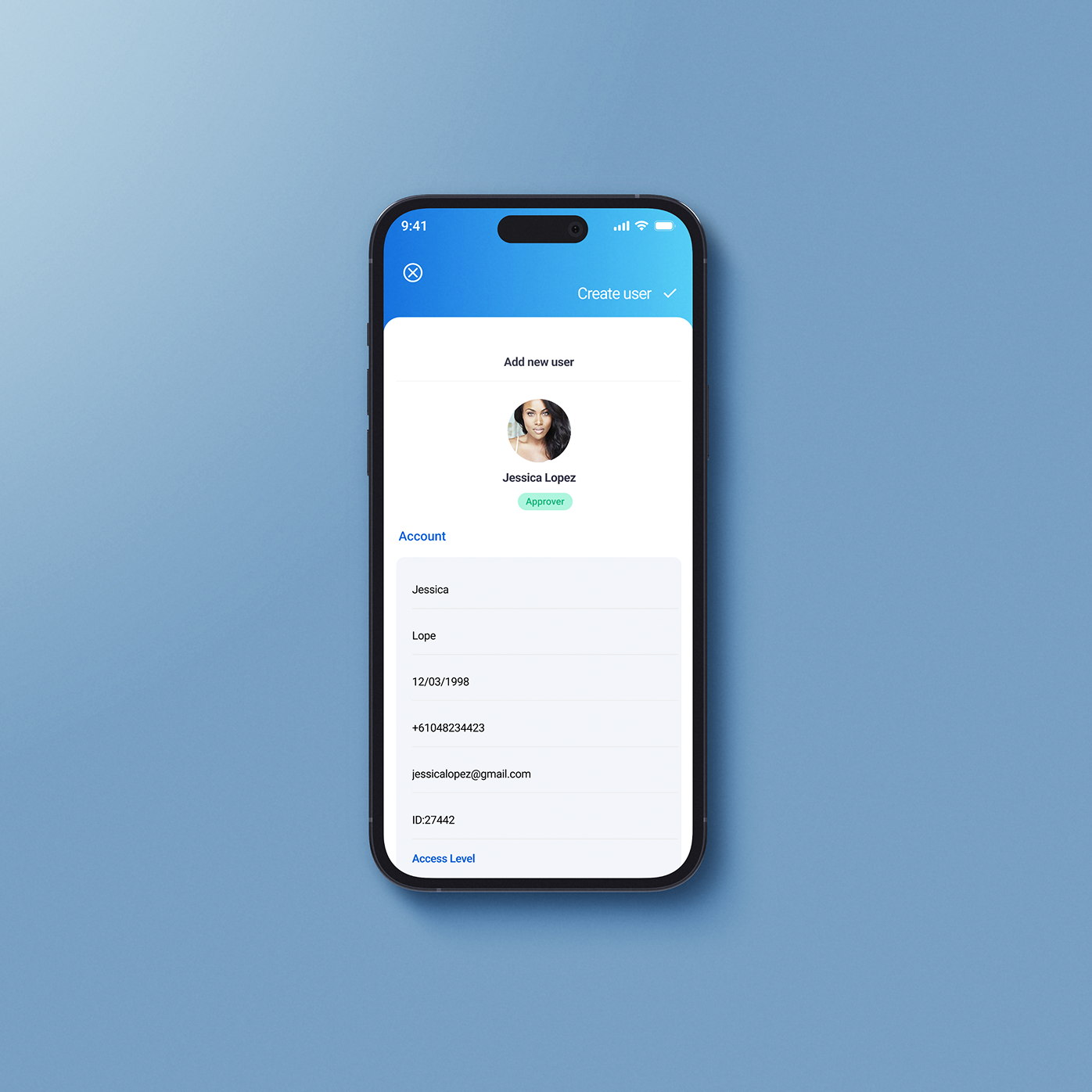
In Telstra Enterprise project, my main UI focus was introducing a dedicated User Button to improve account visibility and control. Enterprise platforms often hide user management inside complex settings, so I redesigned the interface to make access to profile, permissions, and account-level actions clear and immediate. The button was positioned strategically within the top navigation to align with user expectations and reduce friction. Visually, it followed a clean, modular design system to maintain consistency across the dashboard. This small but intentional addition improved usability, reduced cognitive load, and strengthened overall platform clarity.
Final outcomes
This project resulted in a refined enterprise dashboard concept that improved clarity, structure, and user control within a complex B2B environment. By redesigning key interface elements and introducing clearer navigation patterns, I created a more intuitive and scalable digital experience aligned with business goals.
Through this project, I strengthened my ability to work strategically in enterprise contexts, translate research into structured UX decisions, develop scalable UI systems, and design for complex user needs. I learned how small interface improvements can significantly impact usability, efficiency, and overall platform adoption.